candles urban dictionary
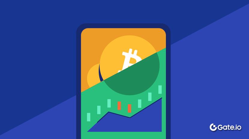
What Is a Candlestick Chart?
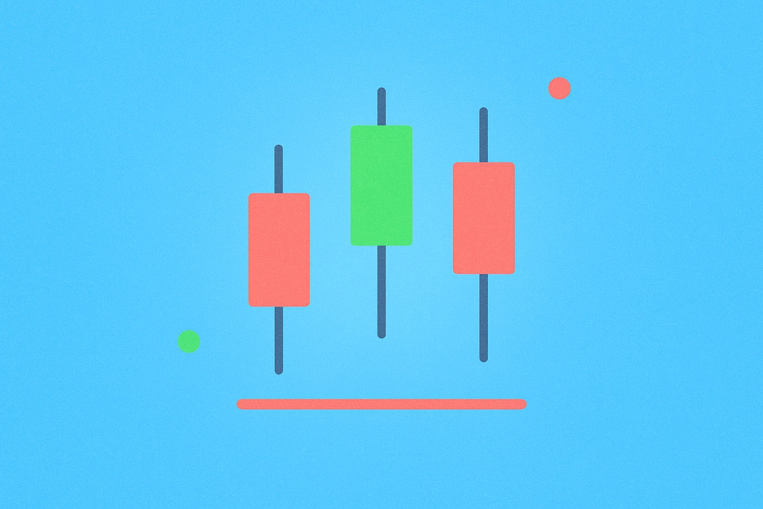
A candlestick chart is a graphical tool used to visualize price movements over a specific period.
Each candlestick represents the “result” of trading during one time frame. It displays the open, close, high, and low prices within that period: the rectangular section is called the “body,” while the thin lines above and below are the “wicks” or “shadows.” If the closing price is higher than the opening price, the candle often appears green or red to indicate upward movement; if the closing price is lower, it typically signals a decline.
A single chart arranges many candlesticks in chronological order. Common intervals include 1 minute, 5 minutes, 1 hour, 4 hours, daily, and weekly. Shorter time frames offer faster signals but more noise; longer time frames provide clearer trends but slower entries.
Why Should You Understand Candlestick Charts?
Candlestick charts allow you to quickly grasp what happened with prices during any given period.
Compared to simple line charts that only plot closing prices, candlestick charts offer additional information such as highs and lows, helping you spot “spikes and pullbacks” or “dips and recoveries.” This is essential for assessing trend strength and identifying false breakouts.
In crypto markets, where prices move 24/7 and news breaks rapidly, candlestick charts help you instantly spot key chart patterns on platforms like Gate. Combined with trading volume, they help you quickly decide whether to wait, add to a position, or set a stop-loss.
For beginners, learning to recognize several high-frequency patterns and basic reading techniques can often reduce emotional mistakes like chasing rallies or panic selling.
How Do Candlestick Charts Work?
Each candlestick is plotted using four price points: open, high, low, and close.
If the closing price exceeds the opening price, the body marks the upward range; if the closing price is lower, the body represents a downward move. The upper wick shows the distance from the top of the body to the highest price reached, while the lower wick marks the distance from the bottom of the body to the lowest price.
Common interpretations include:
- Long Upper Wick: Indicates that upward momentum was met with significant selling pressure, suggesting resistance and a potential pullback.
- Long Lower Wick (also known as hammer or pin bar): Shows buyers stepped in after a dip, often appearing at local lows and signaling buying interest. A typical threshold is when the wick is at least twice as long as the body.
- Engulfing Pattern: Occurs when one candle’s body completely covers that of the previous candle. A bullish engulfing pattern (upward) is seen as strong buying momentum; bearish engulfing (downward) indicates sellers are in control. The pattern’s reliability increases when accompanied by higher volume.
Time frame affects interpretation. For example, a long wick on a daily candle carries more weight than one on a 5-minute chart because it reflects more trading activity. Remember that patterns only provide probabilities—not certainties—and should be used alongside analysis of support/resistance levels and trading volume.
How Are Candlestick Charts Used in Crypto?
Candlestick charts are most intuitive for spot trading, derivatives, new listings, and event-driven moves.
On Gate spot trading, major pairs like BTC/USDT use daily candles to observe mid-term trends, while 4-hour candles help with market timing. For instance, if a long upper wick forms near a previous high with high volume, it often signals increased short-term profit taking.
In Gate’s futures markets (whether USD-margined or coin-margined), extreme volatility can create “long wicks.” This sometimes results from liquidation cascades: price swiftly triggers stop-losses or liquidations, creating an extended wick before snapping back to its prior range.
Newly listed tokens or thinly traded pairs are prone to “long pin bars.” When order book depth is low, even small trades can push prices sharply up or down in a short span, resulting in oversized wicks.
During major news events, candlesticks often show “probing moves.” For example, around macroeconomic data releases, the 1-hour candle may briefly test support or resistance before returning to its range—leaving a wick that signals market testing.
How to Use Candlestick Charts for Trading Plans
First set your framework, then your triggers, then your risk controls.
Step 1: Choose time frame and direction. Use daily or 4-hour candles to identify overall trend direction; only look for entries aligned with this trend. Shorter time frames like 15 minutes can fine-tune entries.
Step 2: Mark key levels. Identify previous highs/lows and zones of heavy trading activity—these are areas where effective patterns are more likely to appear.
Step 3: Define triggers. A common approach is “pattern + close confirmation”: for example, after spotting a long lower wick at support, wait for the next candle to close above support before entering. You can also use “bullish engulfing with volume” as a breakout signal. Typical criteria: close price breaks a key level by 1%–2% and volume exceeds the average of the last 20 candles.
Step 4: Set stop-loss and position size. Place your stop-loss at a point where the pattern would be invalidated—for longs, just below the low of a long lower wick. Limit risk per trade to 1%–2% of your account balance; target levels should be at least twice your stop distance (risk/reward ratio ≥ 1:2).
Step 5: Execute and review. On Gate charts, add indicators like volume and moving averages; follow your plan precisely and afterward record whether patterns formed near key levels and if volume confirmed them.
Example workflow on Gate charts:
Step 1: Choose BTC/USDT spot on Gate, switch to daily time frame and candlestick view.
Step 2: Add volume and a 20-period moving average; mark previous highs/lows.
Step 3: Wait for a long lower wick near support; if the next candle closes above support with high volume, enter a small long position. Set stop-loss just below the wick’s low and target either previous highs or a 1:2 risk/reward ratio.
Recent Trends and Data on Candlestick Charts
In the past year (2025), combining “replicable statistical metrics” with “event windows” has been especially valuable.
- Proportion of High-Volatility Days: For BTC/USDT daily candles, track what percentage of days had an intraday range ≥3%, monitoring this monthly. In Q3 and Q4 of 2025, note if high-volatility days cluster around major macro events or industry news.
- Density of Long Wicks: Define “long wick” as one where the wick is at least twice the body’s length on daily candles; count their monthly frequency in H2 2025. Clusters near key price zones (previous highs/lows) often signal frequent probing or stop-hunting.
- Time-of-Day Differences: Using 1-hour candles in Q3–Q4 2025, calculate average volatility across trading sessions (e.g., US Eastern Time). More active sessions tend to show larger single-candle moves and more reliable volume-validated patterns.
- Volume-Price Correlation: Record instances where engulfing patterns form alongside above-average volume (compared to prior 20 candles), then track how often the next 1–3 candles follow through in that direction. Run these comparisons across major versus mid-tier tokens for deeper insight.
All these stats can be done directly on Gate charts or by exporting candlestick data. Use “full-year 2025” and “Q3/Q4 2025” as standard periods to enable easy year-over-year comparison.
Common Misconceptions About Candlestick Charts
Mistaking patterns for “guaranteed outcomes.”
The most frequent mistake is focusing solely on patterns without considering context like key levels or volume. For example, a long lower wick away from support or lacking volume confirmation loses significance.
Ignoring conflicts across time frames. A bullish signal on a 5-minute chart may simply be a small bounce within a daily downtrend. Always align entries with higher time-frame trends first.
Neglecting risk management. Taking oversized positions based on one candle without setting stop-losses—or placing stops too tight—can lead to being stopped out by normal volatility. Use fixed risk percentages and maintain at least a 1:2 risk/reward ratio to cap losses and maximize gains.
Overfitting pattern terminology. There are countless names for patterns but only those confirmed by “location + volume + close confirmation” tend to matter. Fewer rules lead to more consistent results.
Overlooking trading costs and slippage. Especially in thinly traded pairs, long wicks may come with wide spreads—always assess possible execution price deviation before entering or exiting trades.
Related Terms
- Candlestick Chart: A chart used in technical analysis that shows open, close, high, and low prices over a specific time period.
- Candlestick Chart: A price chart using candle-shaped markers; wicks show the full price range.
- Technical Analysis: A method of forecasting future prices by studying past price and volume data.
- Support Level: A historical price level where downward moves have repeatedly found buying interest.
- Resistance Level: A historical price level where upward moves have repeatedly met selling pressure.
FAQ
What Do Wicks Represent in Candlestick Charts?
The wicks (or shadows) are thin lines extending above and below each candle body that represent the highest and lowest prices reached during that time frame. The upper wick marks the session high; the lower wick marks the session low. Longer wicks signal greater volatility; shorter wicks indicate more stable prices—they are key indicators of market volatility.
Do Green and Red Candles Always Mean Up or Down?
This depends on your platform’s settings. On Gate and most platforms, green candles indicate price increases (close above open), while red candles mean price decreases (close below open). Some platforms may use opposite color schemes; always check your platform’s color conventions before trading to avoid misreading signals.
Which Time Frames Suit Different Trading Styles?
Different candlestick intervals fit different traders: short-term traders typically use 15-minute or 1-hour charts for quick opportunities; swing traders focus on 4-hour or daily charts for trend confirmation; long-term investors rely on weekly or monthly charts for big-picture direction. Beginners should start with daily charts—they make it easier to spot key resistance levels and support areas.
What Are Common Mistakes Beginners Make With Candlestick Charts?
Typical errors include making decisions based on single candles (ignoring overall trend), over-analyzing short time frames (getting whipsawed), ignoring volume (leading to unreliable signals), or mechanically applying patterns without considering market context. Combine multi-time-frame analysis, volume confirmation, and broader trend assessment to avoid being misled by isolated signals.
How Can You Quickly Switch Candlestick Time Frames on Gate?
On Gate’s trading interface toolbar, locate the time interval options (typically shown as "1m," "5m," "15m," "1h," "4h," "1d," etc.) and click to switch between them instantly. Compare multiple time frames for any token—for example, confirm overall trend on daily charts first, then fine-tune entry points using 4-hour charts—to improve trade accuracy.
Related Articles
Exploring 8 Major DEX Aggregators: Engines Driving Efficiency and Liquidity in the Crypto Market
What Is Copy Trading And How To Use It?